Innovation Launcher:
connect, support, grow
Digital Design - Politecnico di Milano, 2021
Davide Spallazzo, Francesca Rizzo
Skills
Service design, User Experience, User Interface
Team
Beatrice Barlassina, Pietro Forino, Luigi Di Gennaro, Lorenzo Zanchetta
Introduction question
How can we feel part of a great community and share our ideas inside our university?
First research
Coming from a technical university of talented students with valuable ideas, we found a lack of networking between different courses of study.
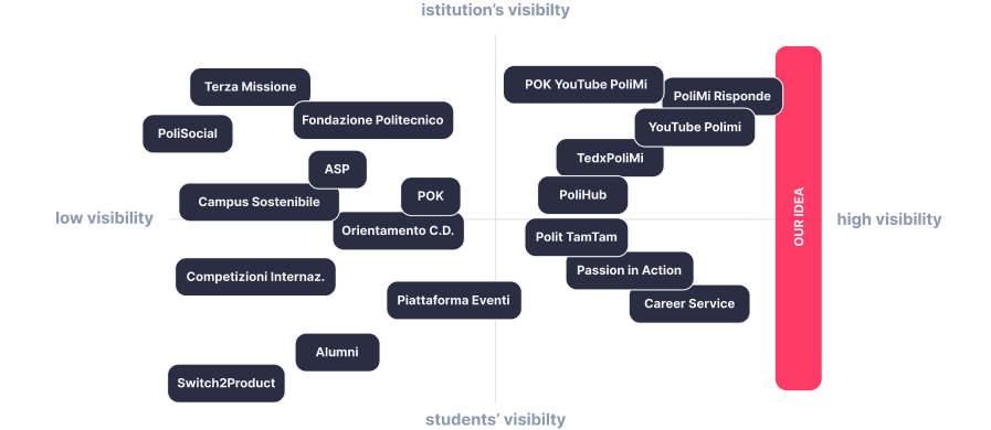
We started to scrape and categorize all the services available at Politecnico di Milano. We then positioned our new service in the matrix. We wanted our idea to be placed in a high visibility scenario, to be useful to both the university and its students.
Concept
Create a new service for students to promote the exchange of ideas, knowledge, and skills to develop innovative and valuable projects.
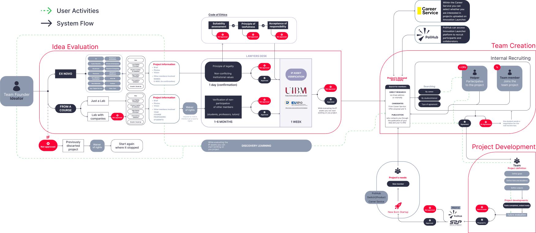
Expert interviews and system flow
We interviewed experts to develop and improve the sequence of the most important flux and functionalities of our new service.
We talked with Polihub, Switcht2products, Filipari and Cazzaniga Lawyer to understand more about different part of their services. We created and refined many times the system flow. The final one is divided in 4 main phases: Idea evaluation, Legal confirmation, Team creation, Project development.


User experience
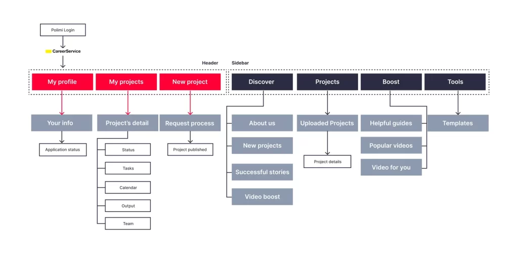
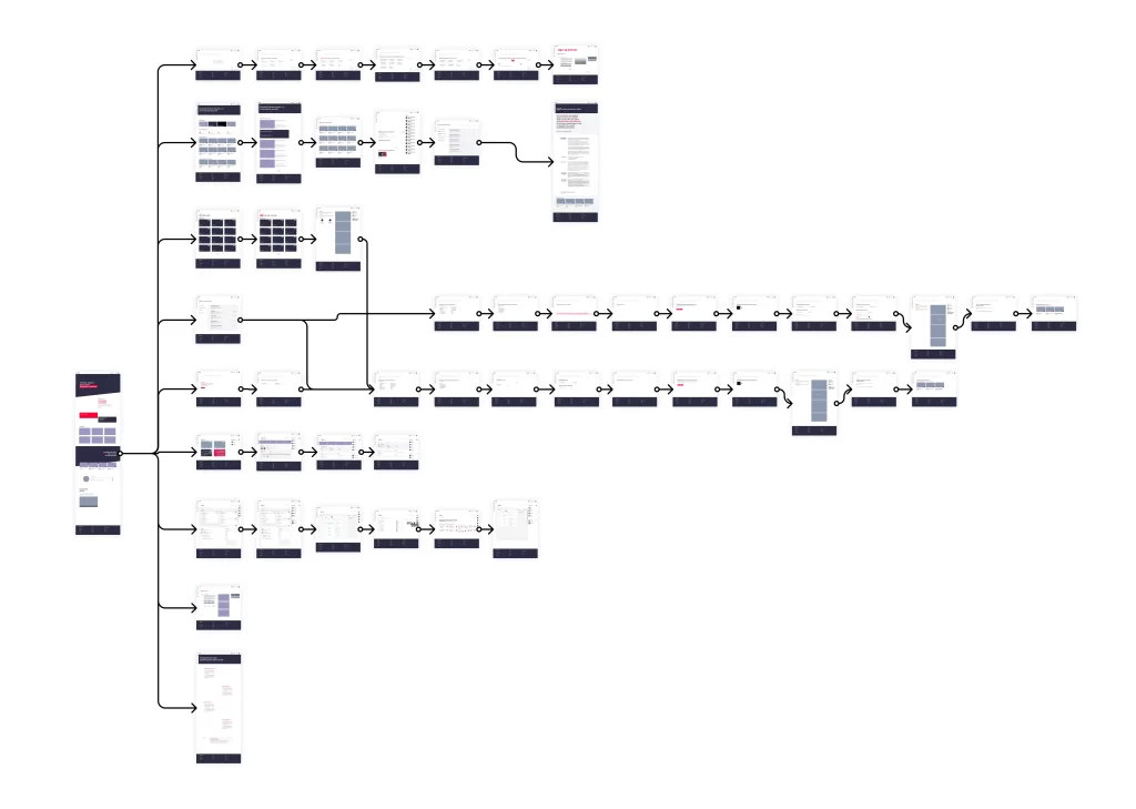
Translating our idea from the System Flow to Information Architecture first and then to the Wireframe was not easy, but thanks to the chance of consulting meaningful sources and having talks with experts, we managed to get straight to the point - simplicity, clarity, and functionality were the goals of our entire service.
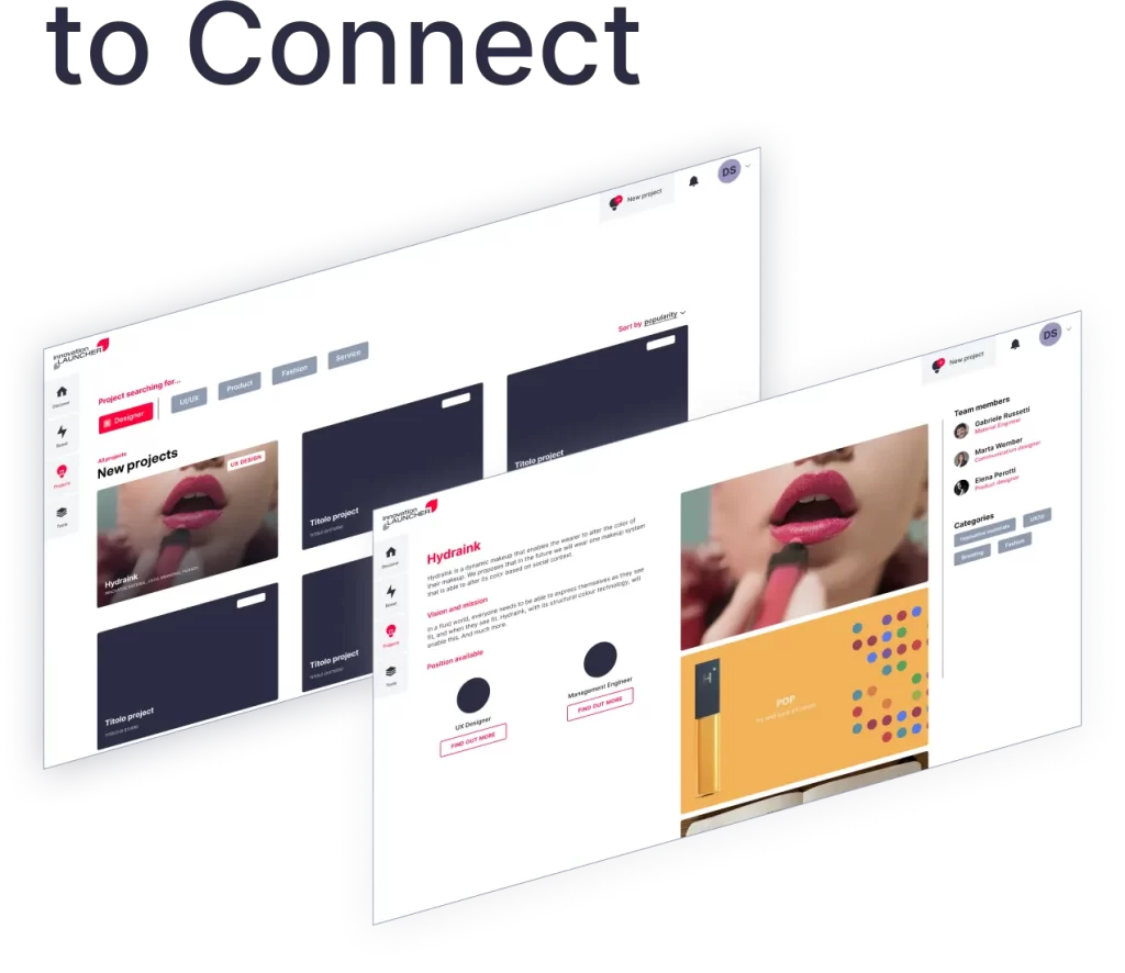
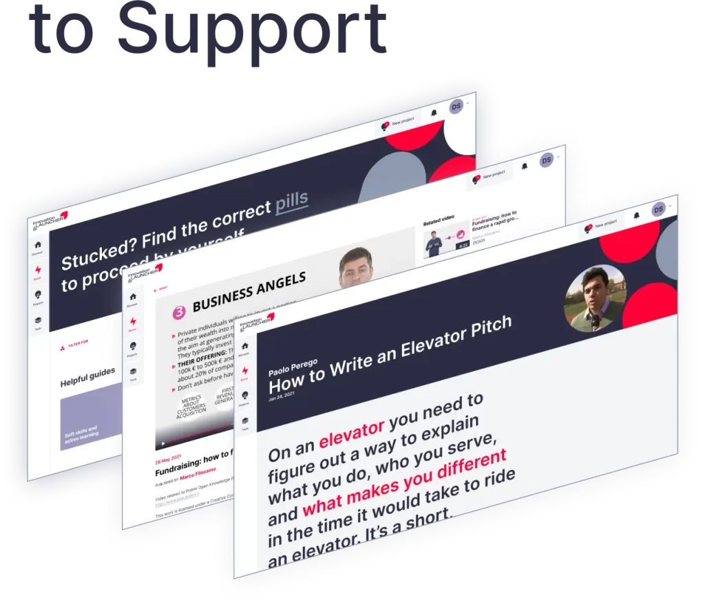
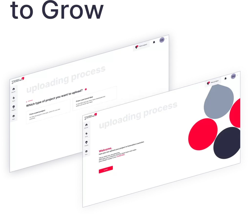
Visual Identity and User Interface
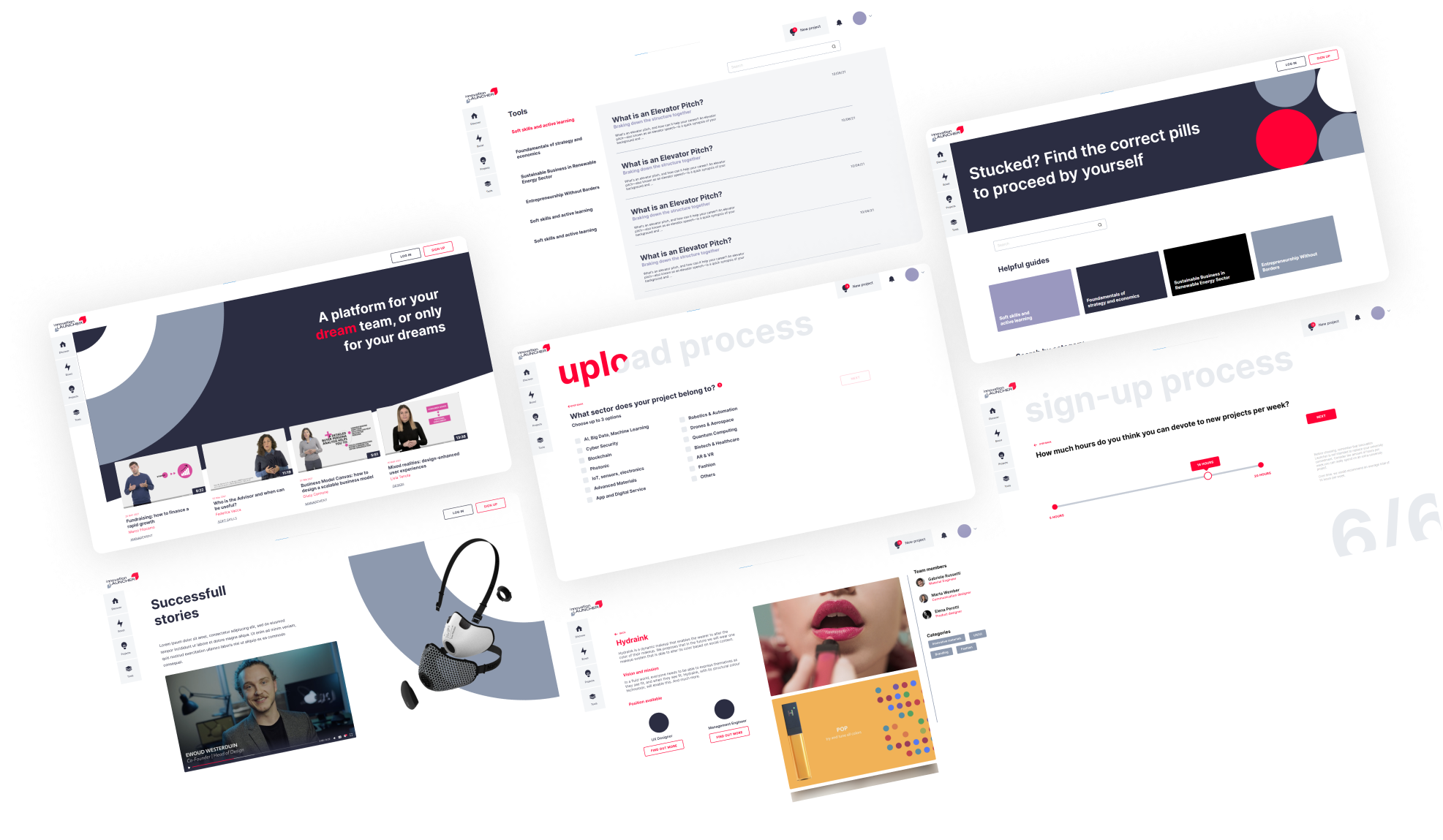
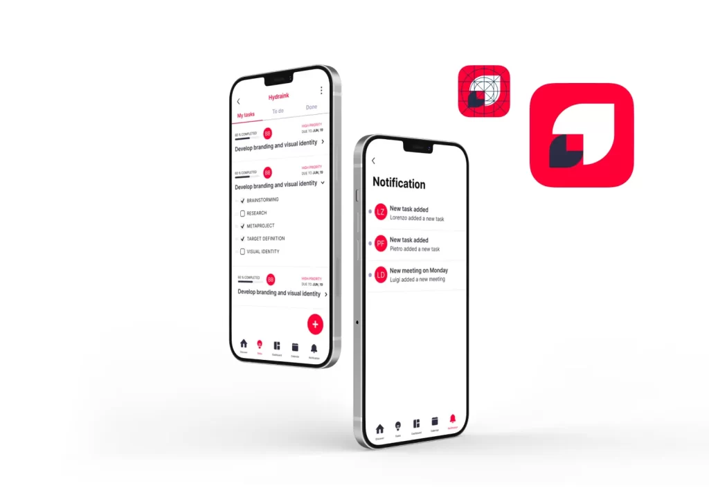
When we thought about the creation of Innovation Launcher, we wanted it to be a reliable and respectable platform, above all one that could be immediately associated with PoliMi.
One of the main challenges was to create a portal that is student-friendly, but at the same time trustworthy for employers and external members. We translated this ambition in our user interface, trying to keep the look&feel of the platform relevant to the objective.
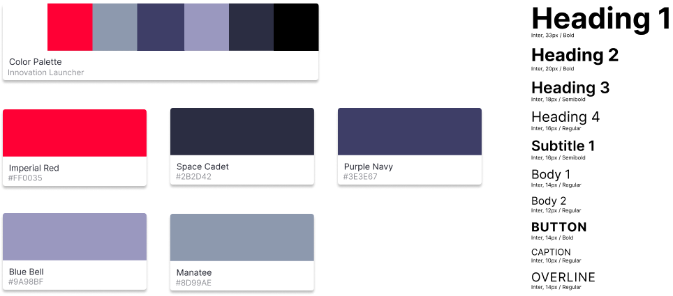
Hi-Fi prototype
We designed our prototype first using Figma, and then we made it interactive with the use of Protopie.
To confirm and validate our platform, we conducted an additional Usability Testing session; the results we obtained were satisfactory to us since most users managed to complete the requests without encountering any major problems.
Communication
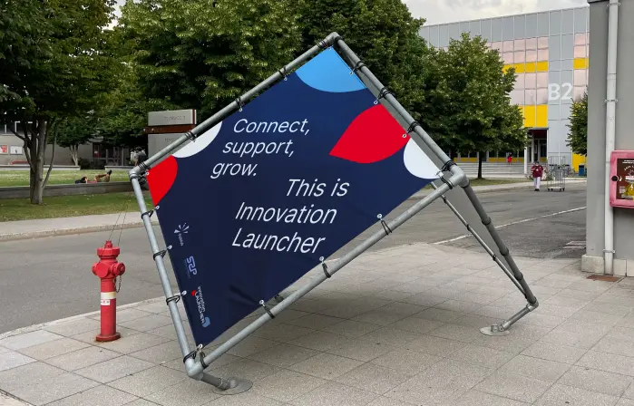
As for the communication strategy, we wanted it to be fresh, considering our defined audience. We created videos and reels to be posted on social media that could easily capture attention, but always respecting the university’s guidelines.
